Developed a content strategy for a global audience and wrote conversational content to help customers.
The Project
Western Union, a global financial company, helps people send money online and through retail locations worldwide.
I revisited their Send Money Online customer journey.
Objectives
Make sending money easier and simpler
Make copy sound friendlier
Localize copy
Help users provide personal information
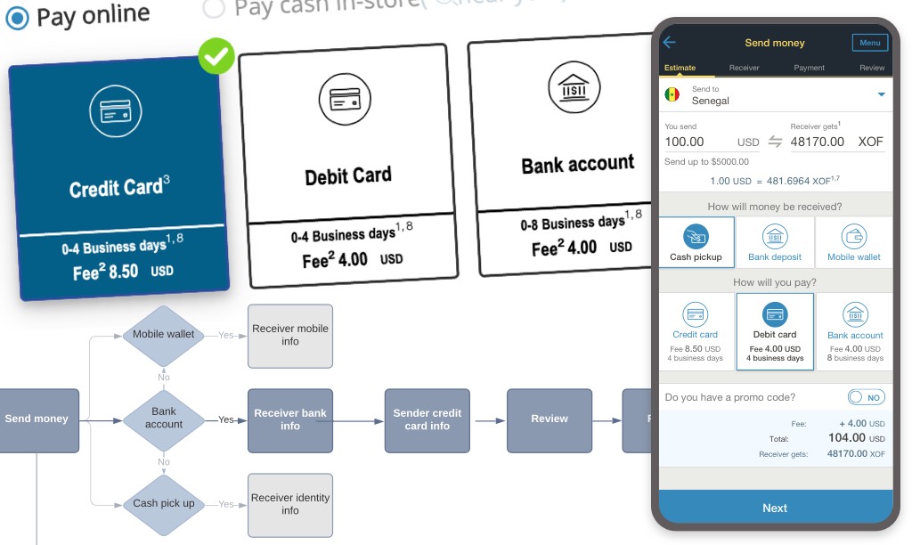
Add new service
The Challenge
Thirty-six percent of customers dropped off in the middle of a transaction because they didn’t know how to proceed. Even when completed, 25% of money transfers ended up on hold or declined because of incomplete or incorrect information.
Content sounded like a bad translation in other languages, making the brand feel disconnected from their local customers.
The process
Team
Product owner
UX designer
UX researcher
Content Designer
Engineer
Date
Jan 2020
My role
Content strategy:
Participated in stakeholders and user interviews
Conducted competitive analysis
Co-created user journey maps and flow redesign
Built content hierarchy/messages priority
Established voice and tone
Crafted writing guidelines
Content Design:
Co-created wireframes with UX designer
Wrote copy
Co-created prototypes with UX designer
Led peer critiques and stakeholders’ feedback reviews
Participated in user testing
Iterated and finalized prototypes with UX designer
The Research
User research
Participated in user surveys and interviews.
Analyzed customer complaint reports.
Identified user pain points.
Competitive analysis
TransferWise
PayPal
Xoom
Apple Pay
Our competitor’s interface copy was simple and clear, and their tone sounded human and friendly.
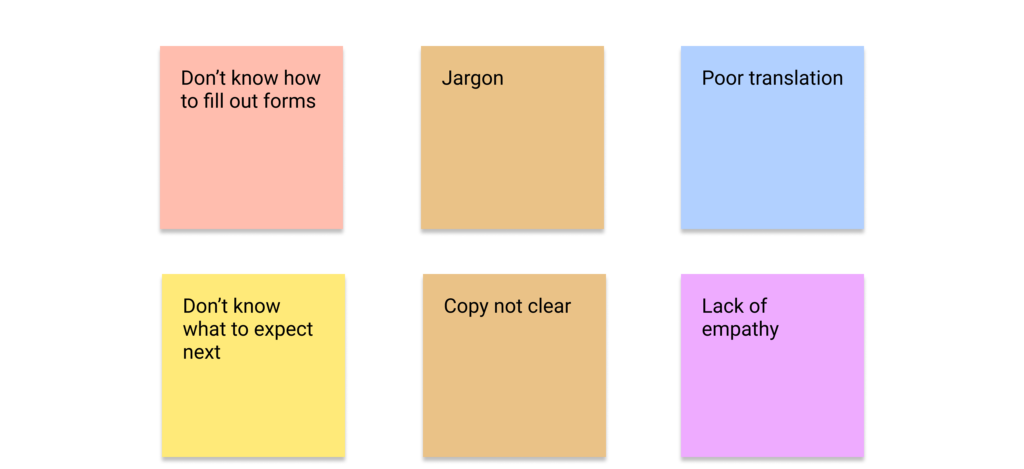
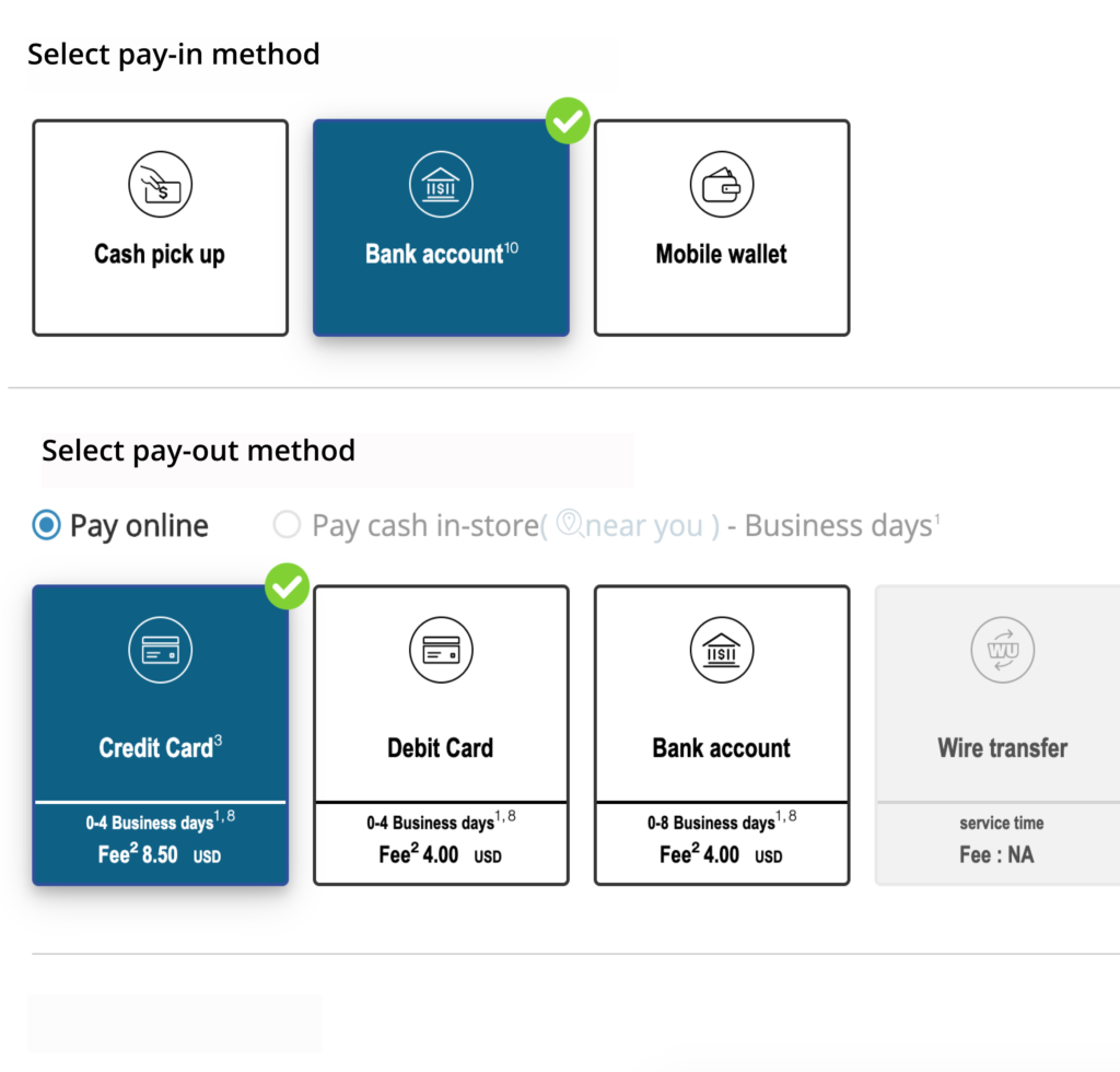
I don't understand what pay-in or pay-out method means.
I wish I had known what to enter before.
The copy sounds weird in French.
Western Union doesn't seem to understand us or care about us.
What are the users' pain points?
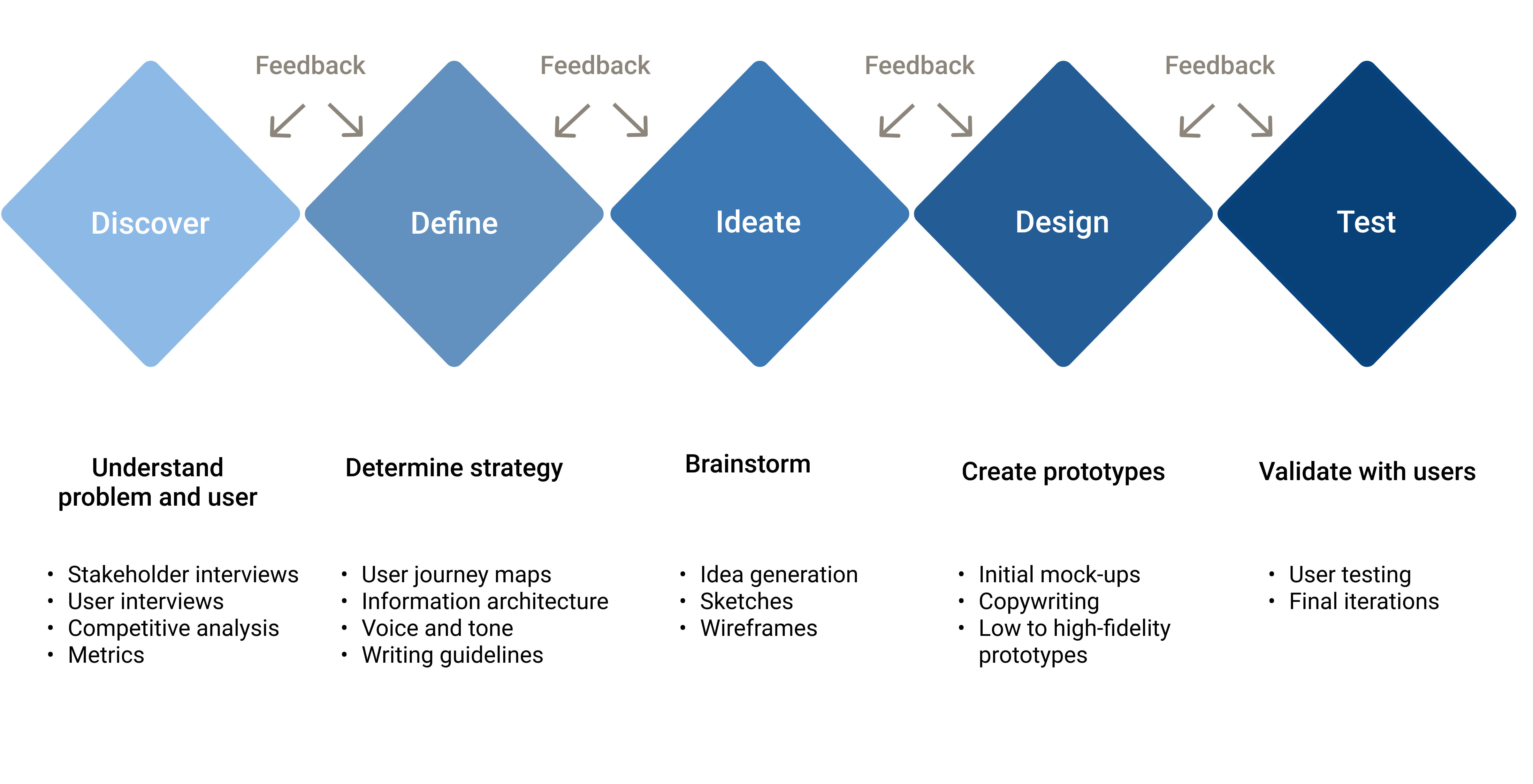
The Strategy
Built information architecture
We met with the product manager, UX Designer, and UX researcher to:
Storyboard the end-to-end user journey.
Identify the information to display based on business requirements and user and stakeholder interviews.
Use card sorting to categorize the content.
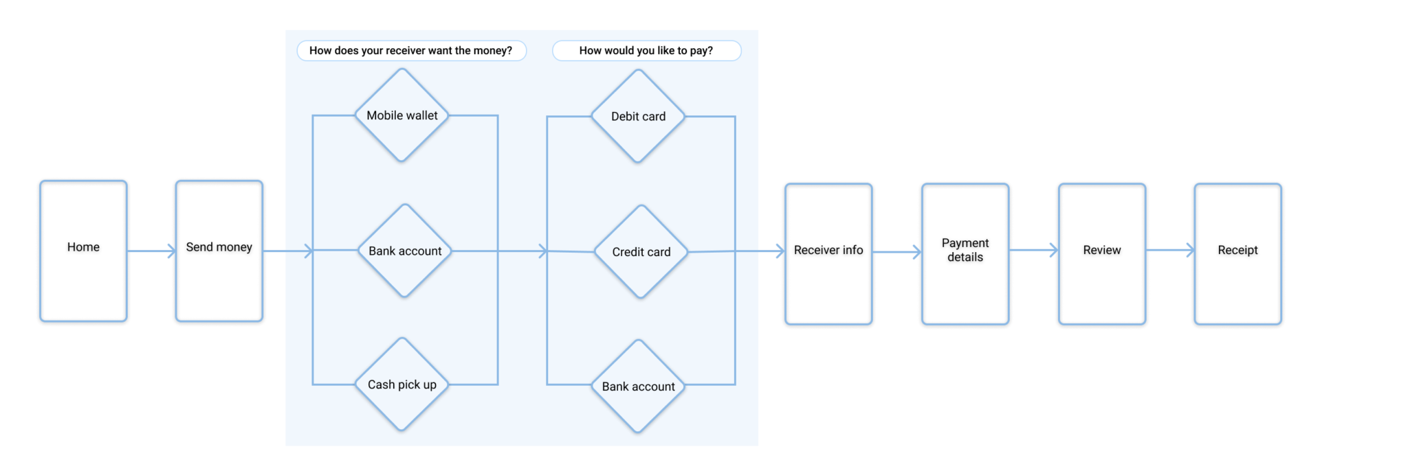
Redesign the user flow.
Redesigned user flow
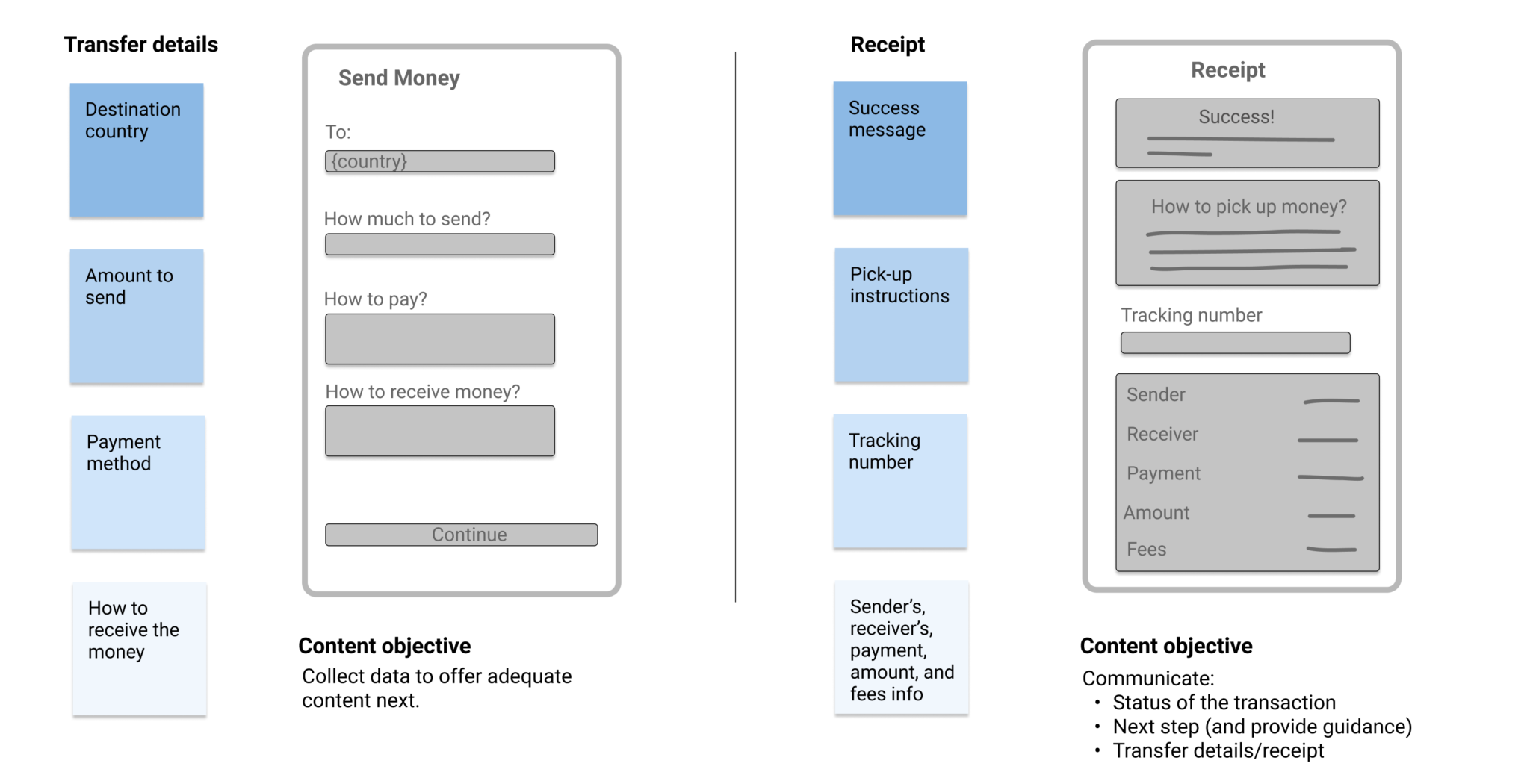
Defined content priority, objective, and patterns
Prioritized messages on each page.
Defined what content should accomplish.
Built content systems (notifications, tooltips and error messages case study).
Sketched and created wireframes with the UX designer.
Our priority was to display and ask only for absolutely necessary information and avoid overwhelming the user.
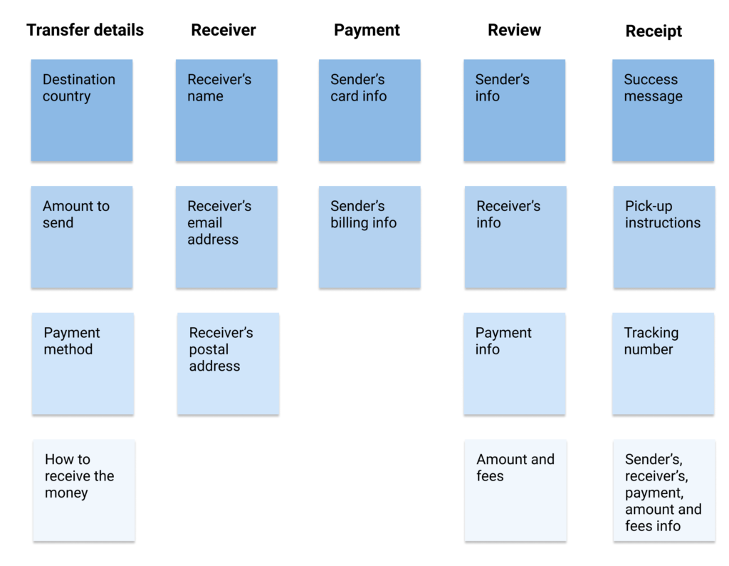
Wireframes
Established voice and tone
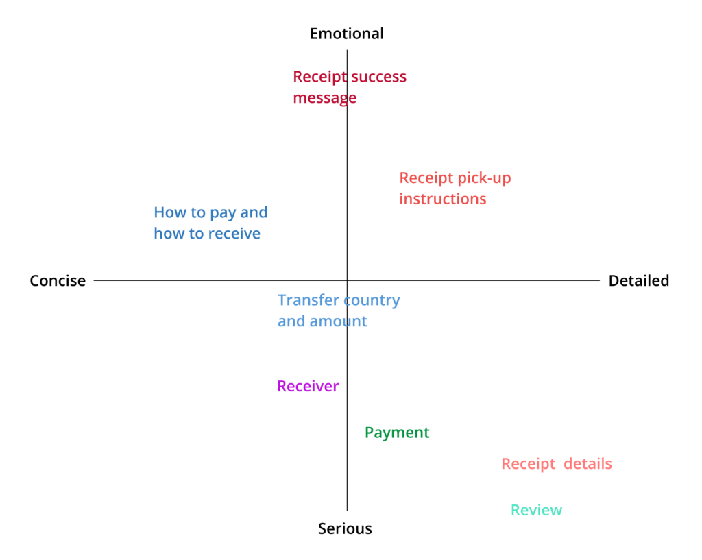
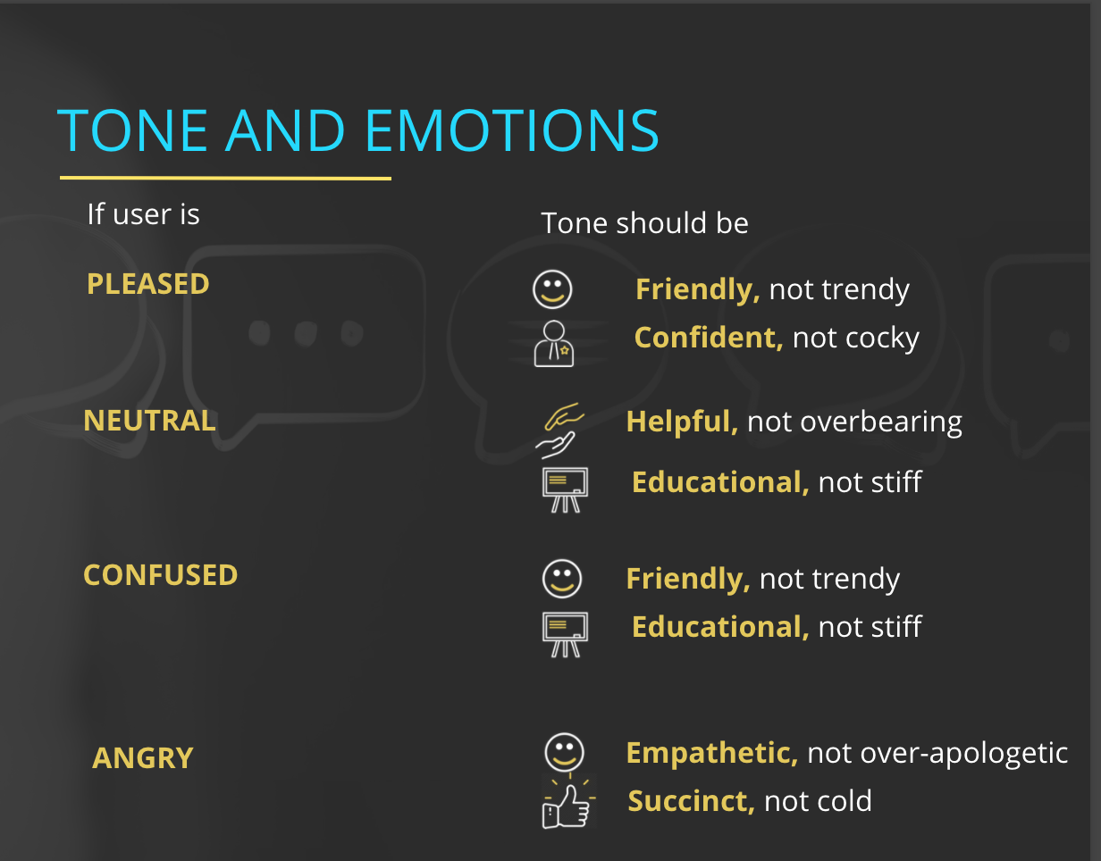
I used Western Union’s voice throughout the entire flow to make it consistent with Western Union’s brand.
But, I adjusted the tone depending on:
The type of content (success message vs. payment details vs. pick-up instructions).
Where the user was in the flow.
How they felt at that moment (happy and satisfied, stressed out, or angry and frustrated).
I created a tone map and tone guidelines to help when writing each of the content elements.
Tone map
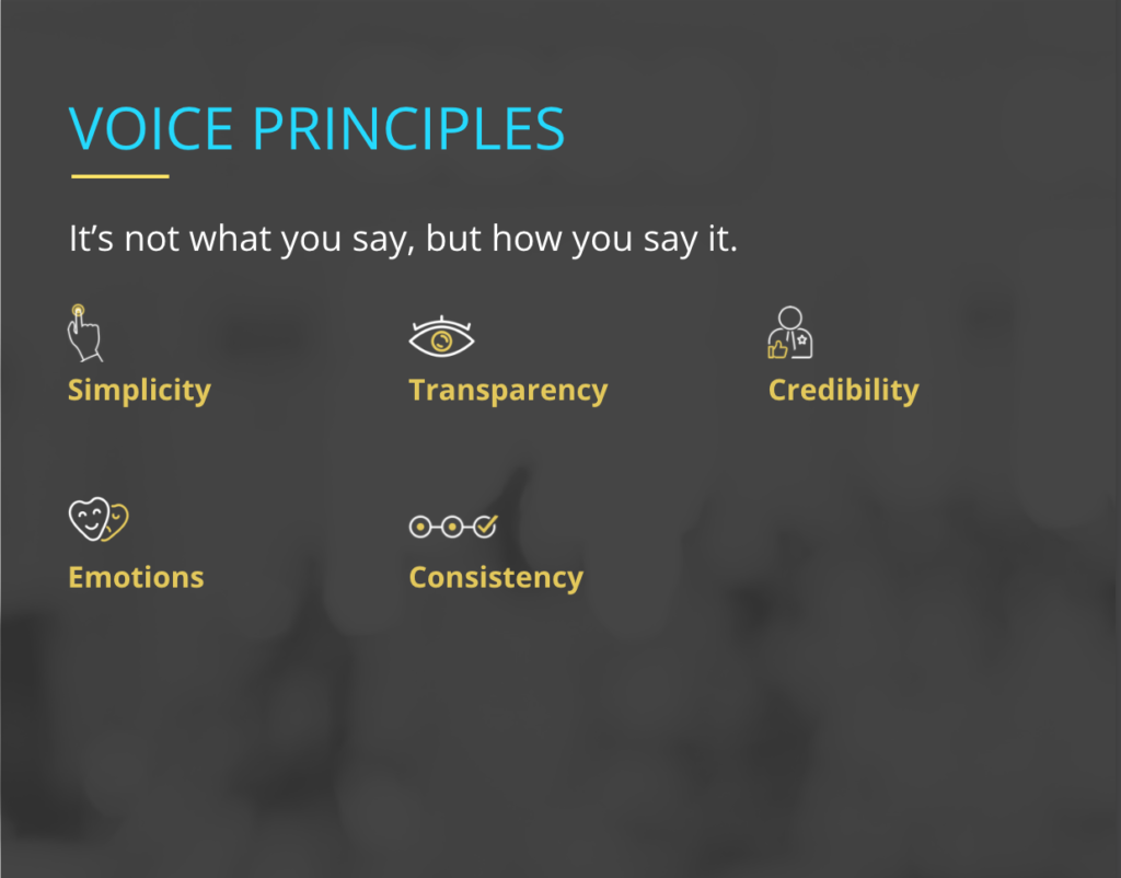
Created content principles and guidelines
I used my knowledge of UX content best practices, the editorial style guide, and the research and content strategy findings to craft content principles and writing guidelines.
Content principles:
The Send Money Online content should help the user send money easily and quickly.
The content should be clear, simple, helpful, and concise.
Avoid extraneous steps or information that distracts the user from sending money.
Keep content consistent throughout the entire flow and with the brand design system and editorial style guide.
Writing guidelines
Avoid jargon.
Use the singular “they/their” to be more inclusive.
Use contractions to sound more conversational, for example, “you’re” instead of “you are.”
Don’t use passive voice. It sounds robotic and not as clear.
Keep your sentences short, one point per sentence, to keep it simple and clear.
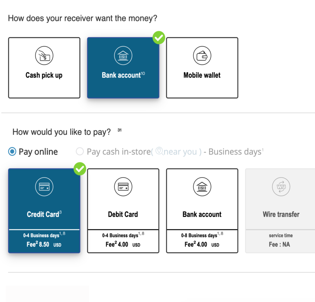
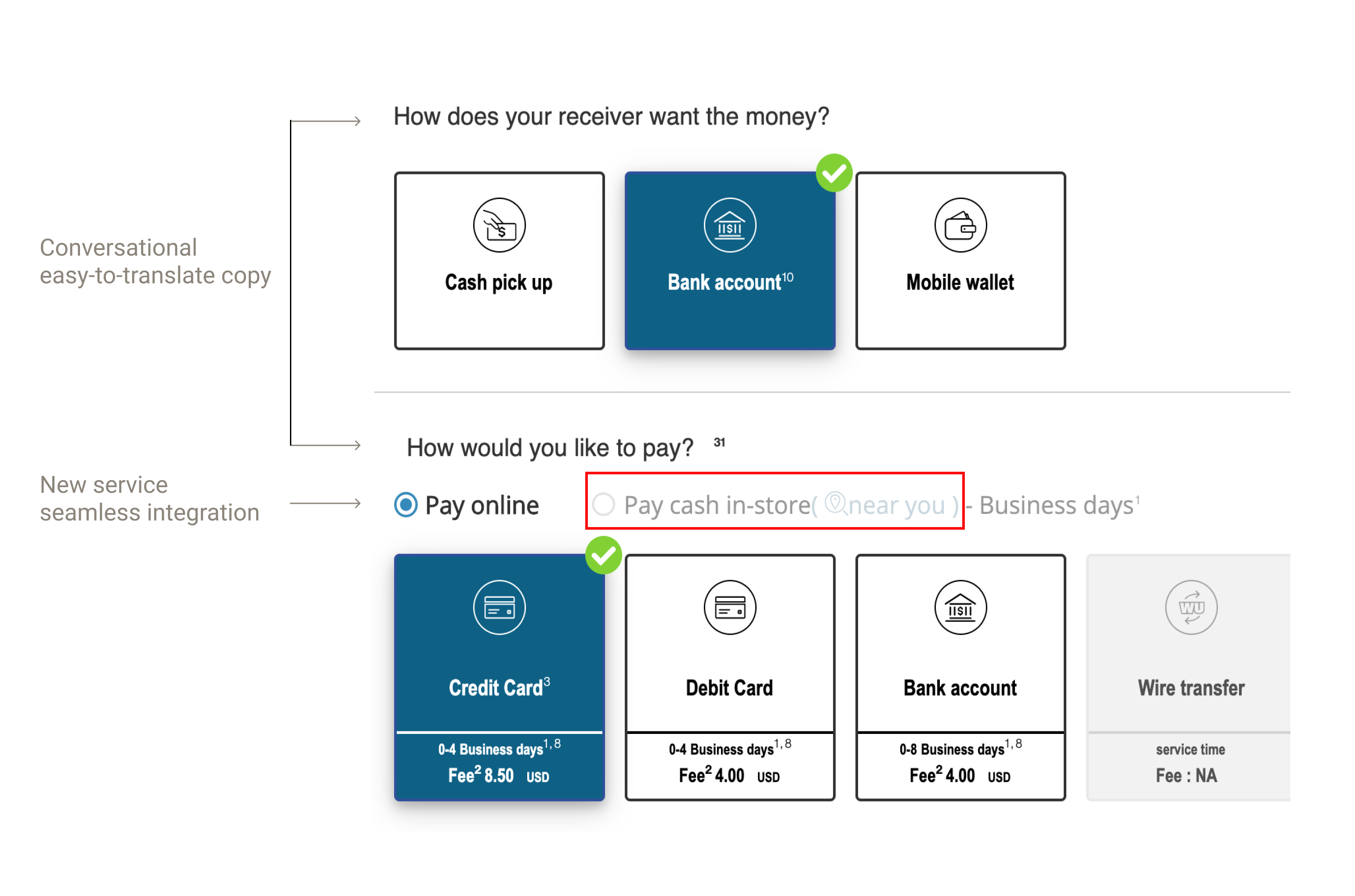
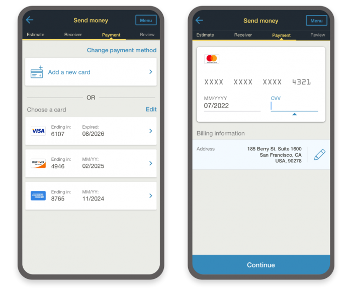
Form/field label: be as clear and concise as possible, for example, “Amount.” If not possible, use simple and conversational copy like questions and everyday vocabulary, for example, “How does your receiver want the money?”
Selection: start with a verb, for example, “Choose.”
Instructions and notifications: be as concise and instructive as possible while remaining friendly and conversational.
Buttons: 1-2 words max. A verb/call-to-action as descriptive of the next step as possible.
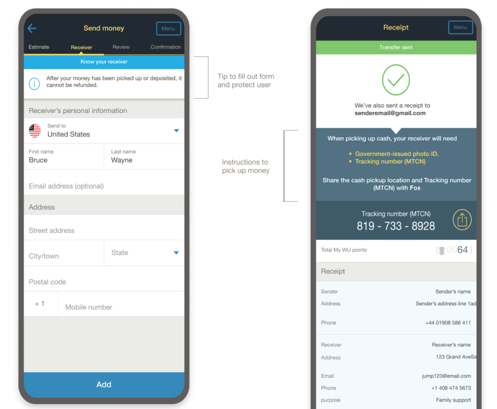
Created prototypes
I sat down with the UX designer, and we wrote and designed together side-by-side to produce prototypes. We collaborated very closely throughout the entire process, from low fidelity to high fidelity prototypes and final iterations.
We brainstormed how to best communicate the messages through language, visuals, or both and how one can enhance the other. We defined content format (toast, notification, pop-up dialog, in-line error).
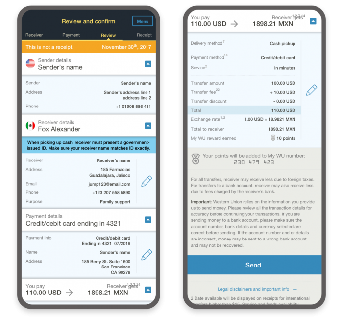
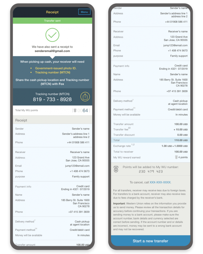
I crafted page names, labels, microcopy, notifications, flow and menu labels, error messages, buttons, and all the content on the send money online flow.
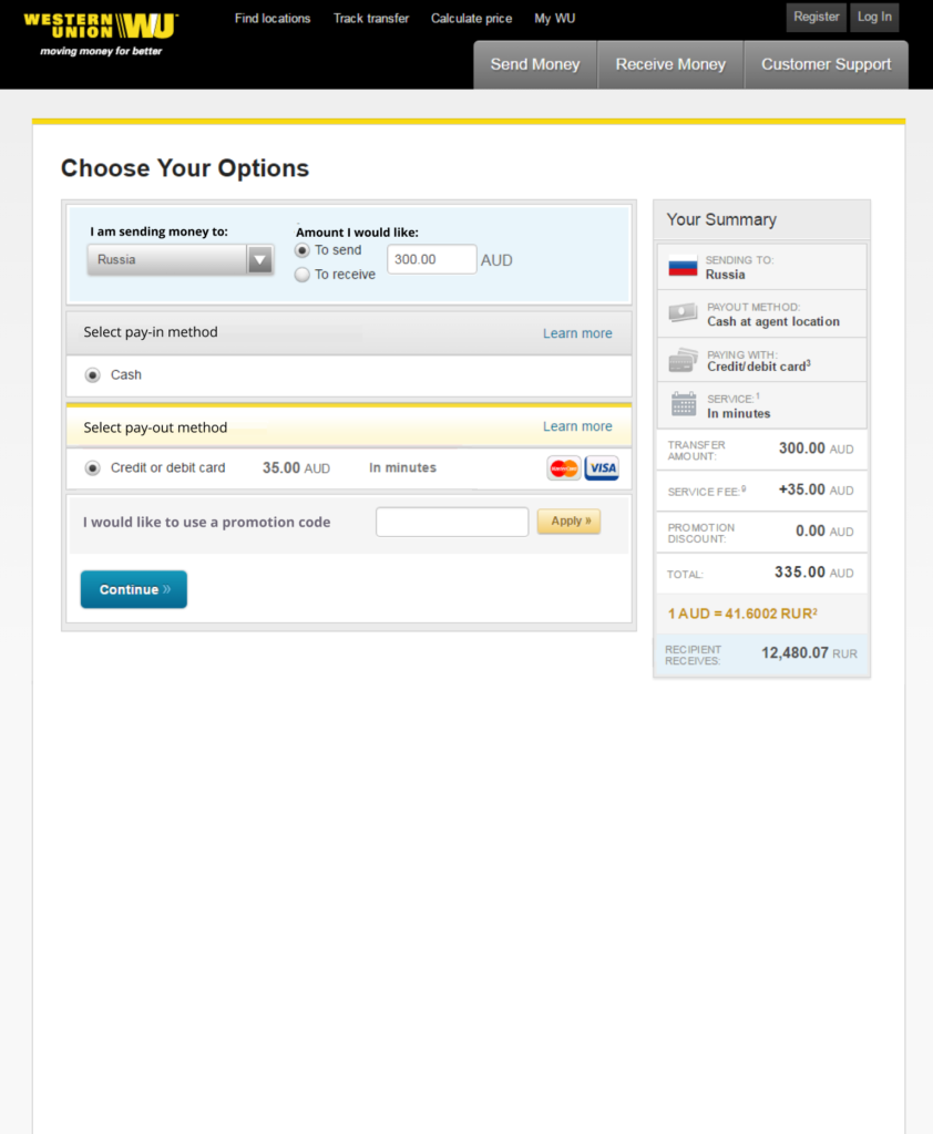
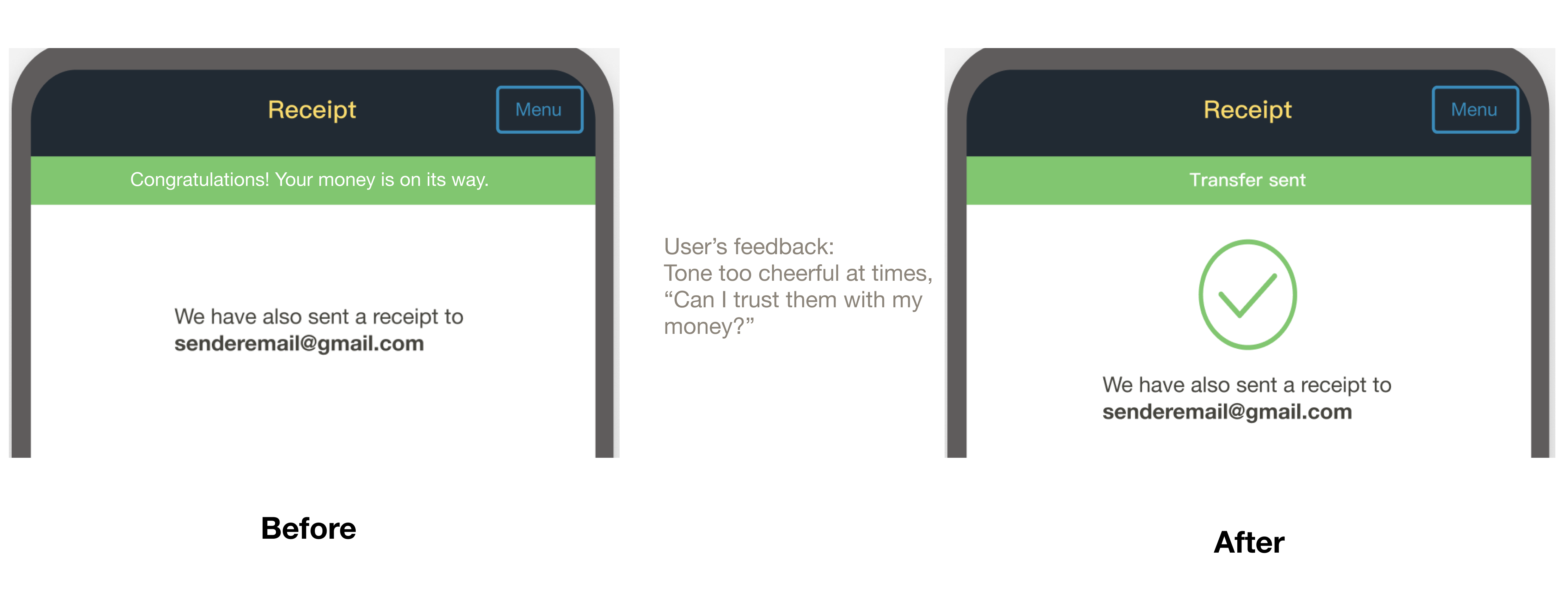
Before
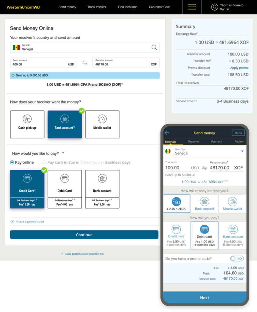
After
Shared with peers and stakeholders
I presented my content to my peers during our weekly critiques. I also shared and rationalized my work with the stakeholders (legal, privacy, fraud, marketing, and localization teams) throughout the entire process.
I used data from user research and metrics, examples from competitive analysis, and storytelling to present my work and explain our vision. We created a step-by-step animated prototype for our presentation. Storytelling helped convince, be more impactful, and confirm that our design aligned with the users’ needs.
Then, I discussed their feedback with my peers and the stakeholders. If they pushed back, I asked questions to understand the root of their concern and I explored further. I also advocated for the user using user research and testing. And I iterated the content to improve user experience.
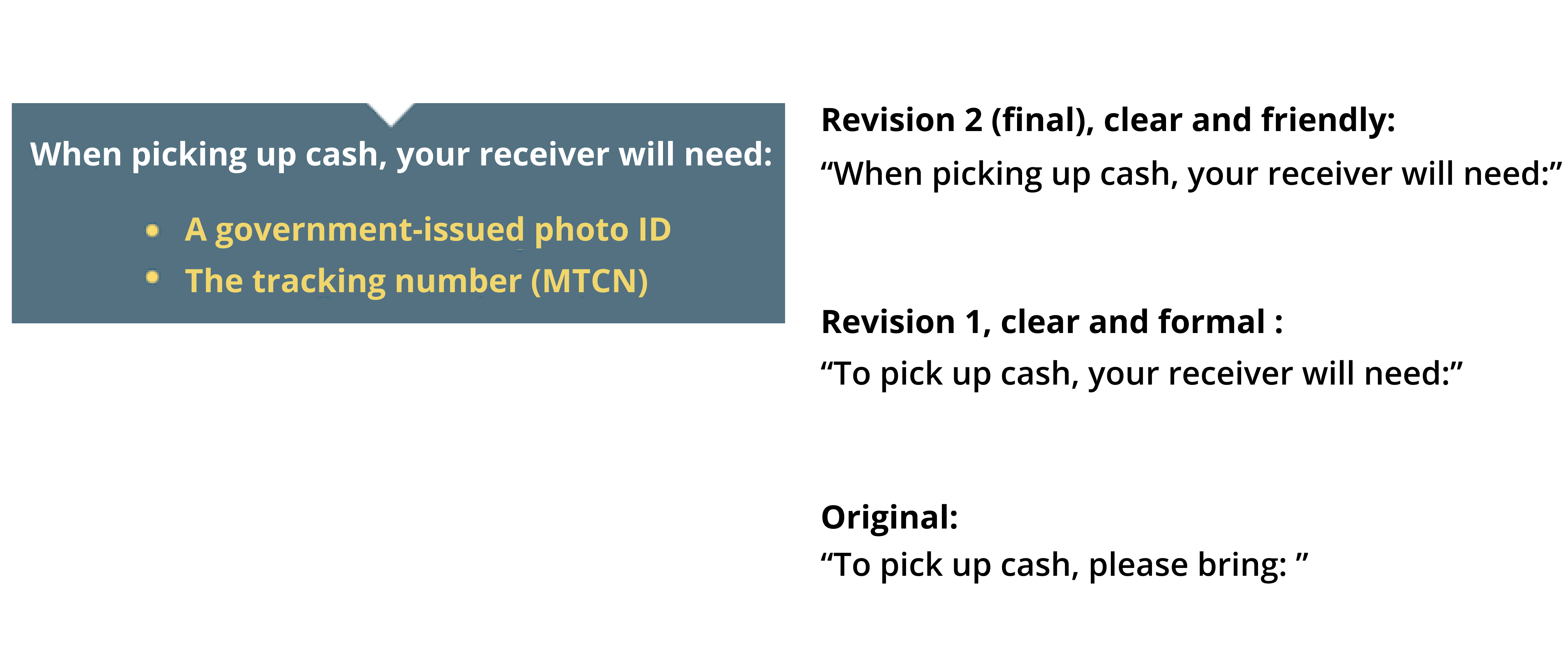
76% of users didn’t understand what “pay-in” or “pay-out” method meant.
48% of users would like Western Union (WU) to sound simpler and clearer, like a person we met in the street.
36% of users would like WU to sound warmer, like a friend.
25% of users would like WU to sound formal, like a financial institution.
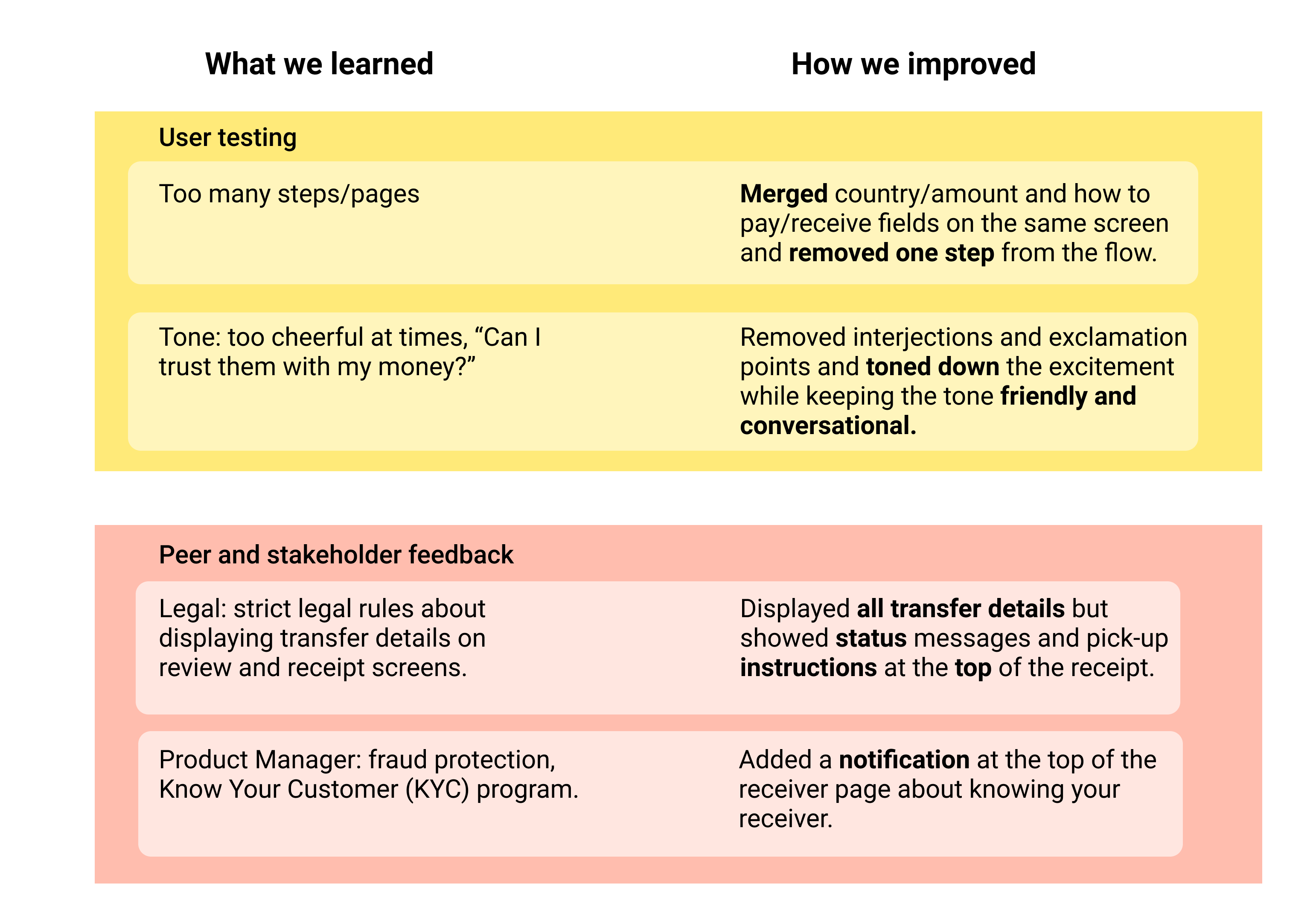
User tested, iterated and finalized prototypes
We tested our prototypes with users throughout the entire process from low to high fidelity and final prototypes to improve and validate:
Usability
Information architecture
Messaging
Content hierarchy
Voice and tone
Language
The UX designer and I updated the content and design to incorporate the user’s feedback at each step of the process.
User, peer, and stakeholder feedback
The Solution
Fixed pain points
I addressed users’ pain points one by one through the customer journey.
I used tooltips, notifications, and error messages to guide and assist customers. I also provided tips and instructions to facilitate their experience.
Tips and instructions to anticipate issues customers may face.
Customers don’t know what to expect next.
Wrote conversational copy
The copy had too much jargon customers didn’t understand. And, the tone sounded too formal and lacked empathy. I rewrote the send money journey copy with a more conversational and human tone, using everyday vocabulary while putting myself in the customer’s shoes.
Before
After
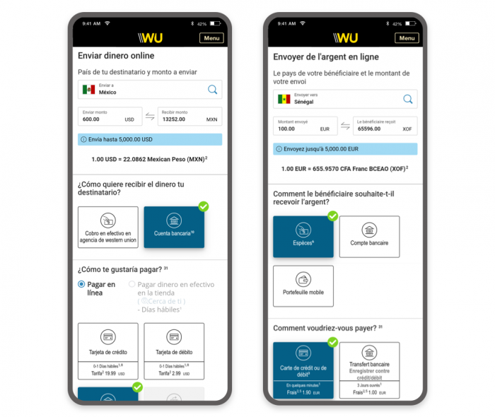
Wrote localized copy
I wrote the copy with localization in mind to get it ready for translation:
I avoided idioms and colloquialisms.
I kept it brief and concise, anticipating space issues for translations.
I wrote conversational copy, which is easier to translate.
Added a new service
We integrated the new Send online, Pay-in store service in the customer journey. We placed it where it made sense in the flow and made it fit seamlessly in the design.