Built a messaging system and wrote simple and concise copy that showed empathy for the user.
Objectives
Create more consistent messages
Make messages clearer and shorter
Show more empathy for users
Help customers complete their transaction
The Project
One-third of Western Union customers send money to their loved ones through Western Union app or website. Inevitably, they encountered errors and notifications.
Some of these messages were outdated or not useful. I revisited them throughout the send money user journey.
The Challenge
There was a multitude of different messages and notifications throughout the user journey. Each project team created its own, resulting in inconsistencies and redundancies.
Thirty-two percent of the users who dropped off in the middle of a transaction left because they couldn’t fill out a form. Customers also felt they didn’t know what to do next and what would happen to their money.
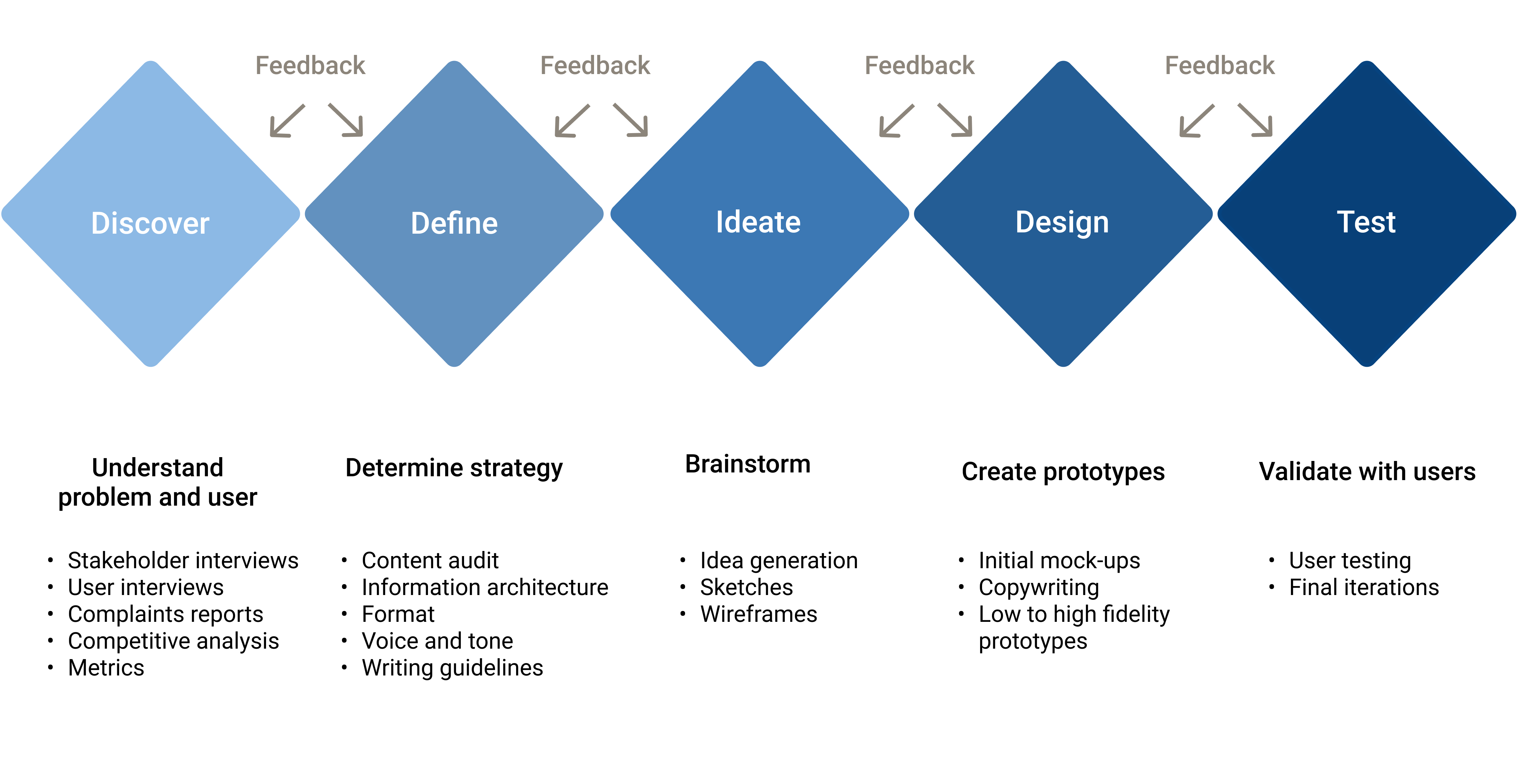
The process
Team
Product owner
UX designer
UX researcher
Content Designer
Engineer
Date
May 2020
My role
Content strategy:
Participated in stakeholders and user interviews.
Reviewed metrics and customer complaints.
Conducted competitive analysis.
Performed a content audit with engineer.
Led content strategy workshops.
Built content hierarchy and defined messages location.
Established voice and tone.
Crafted writing guidelines.
Content Design:
Created wireframes with UX designer.
Rewrote messages copy.
Created prototypes with UX designer.
Led peer critiques and stakeholders’ feedback reviews.
Participated in user testing.
Iterated and finalized prototypes with UX designer.
The Research
User research
Conducted user surveys and empathy interviews.
Analyzed user data and customer complaint reports.
Identified user pain points and drop-off reasons.
Competitive analysis
Spotify
Mailchimp
Booking.com
Dropbox
Our competitors’ error messages were clear, concise, and sounded human. They didn’t blame the user but suggested a solution and even corrected the error automatically at times.
I also researched error message best practices.
I felt blamed for doing something wrong.
I didn't understand what was wrong.
I didn't know how to fix it.
It seemed difficult and very technical.
The Strategy
Content audit
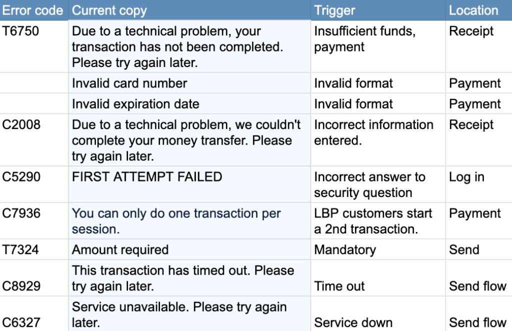
I conducted an audit with the engineer to:
Identify all the error messages and notifications we used.
Remove duplicates and outdated error messages.
Identify and prioritize messages to rewrite based on error incidence report.
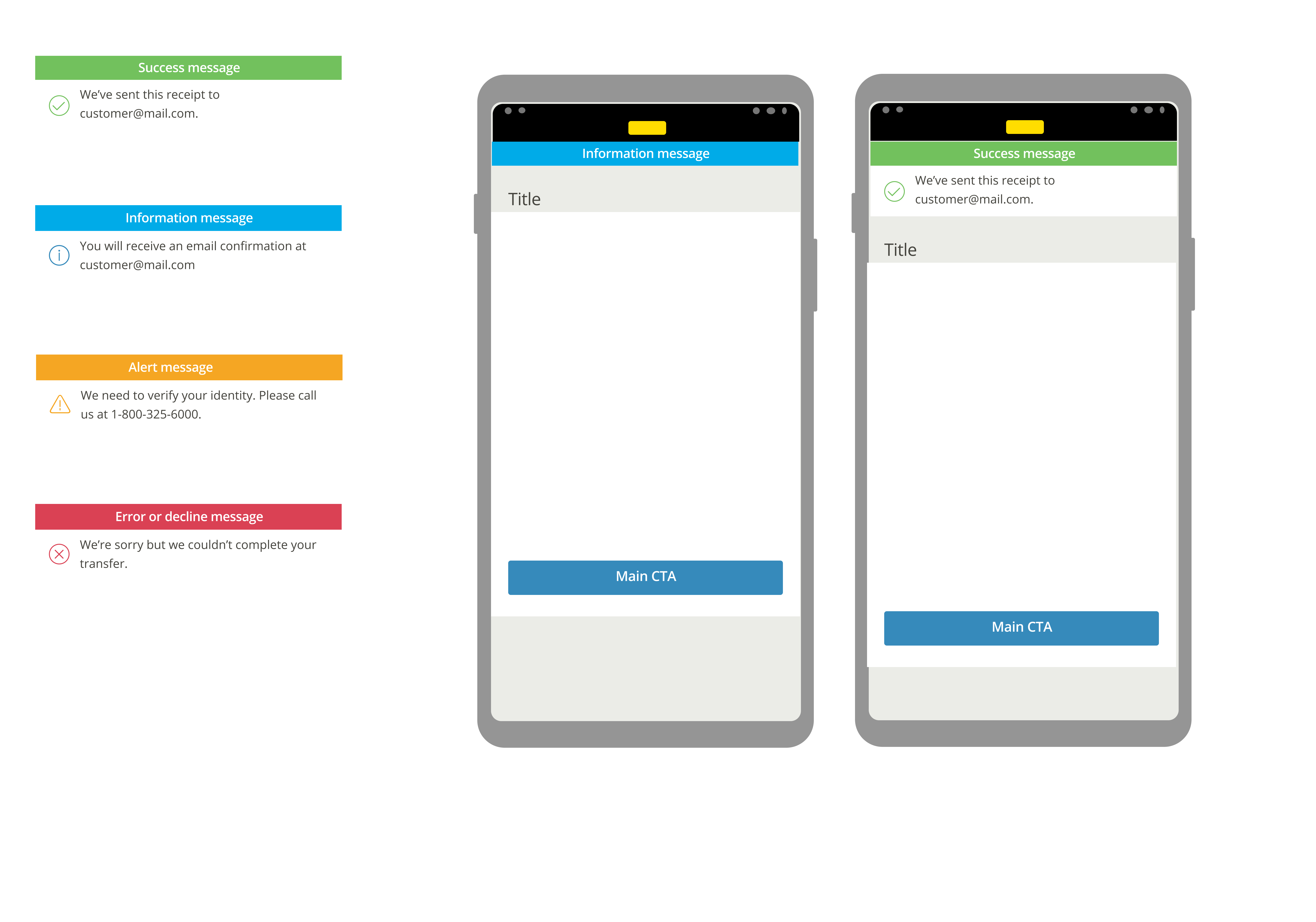
We classified them, and for each category, decided:
How urgent?
What visuals?
Which tone?
Where to place them?
We built a messages system to organize and make them more consistent.
Audit spreadsheet
Messages categories
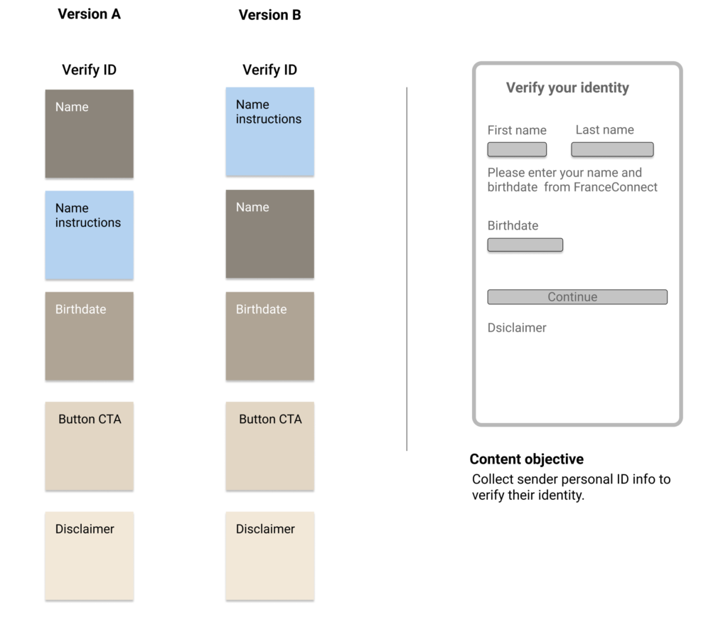
Defined content hierarchy and formats
For each category of messages:
Determined the best location.
Defined best format (inline vs. dialog vs. toast, or notifications).
Sketched and created wireframes with the UX designer.
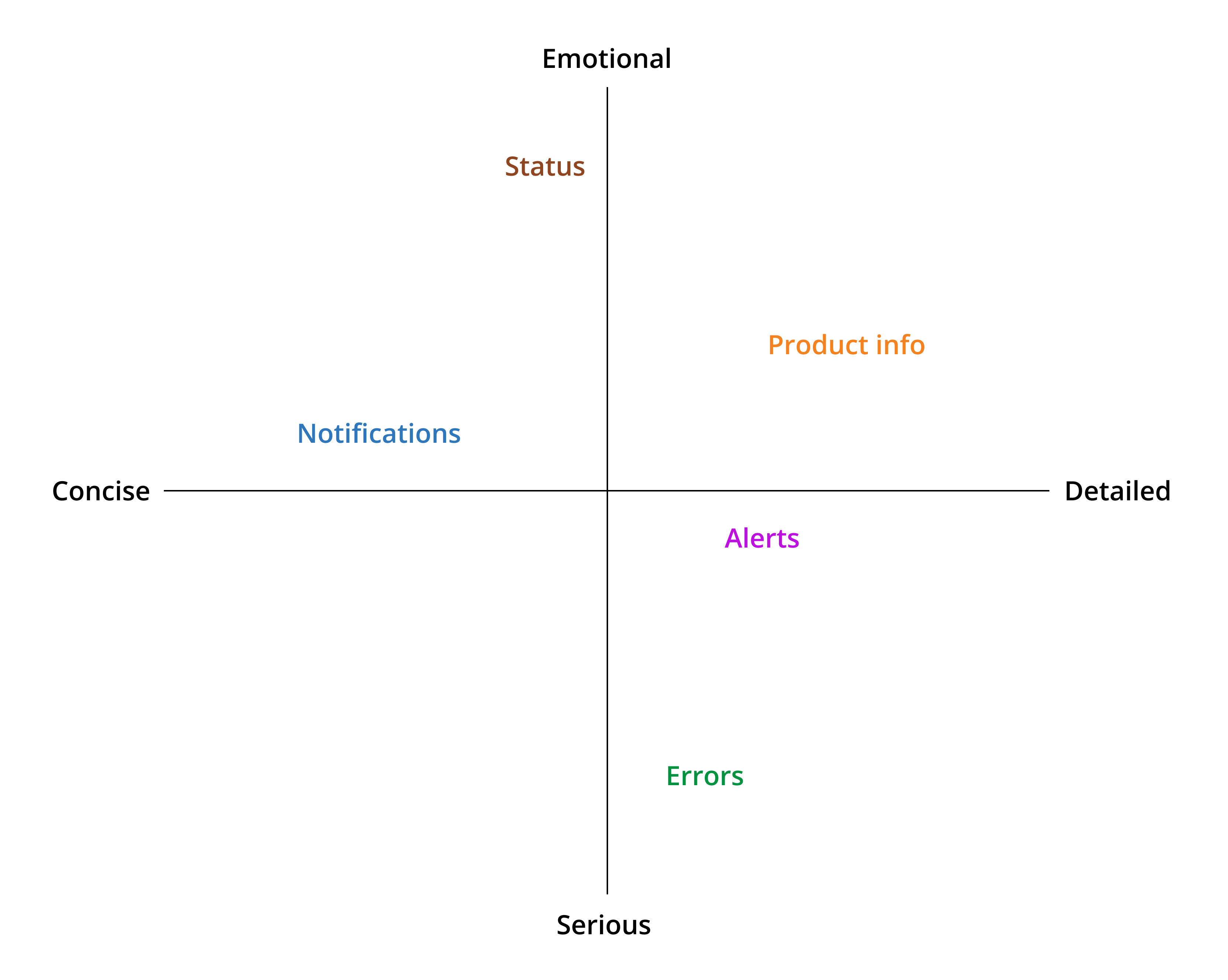
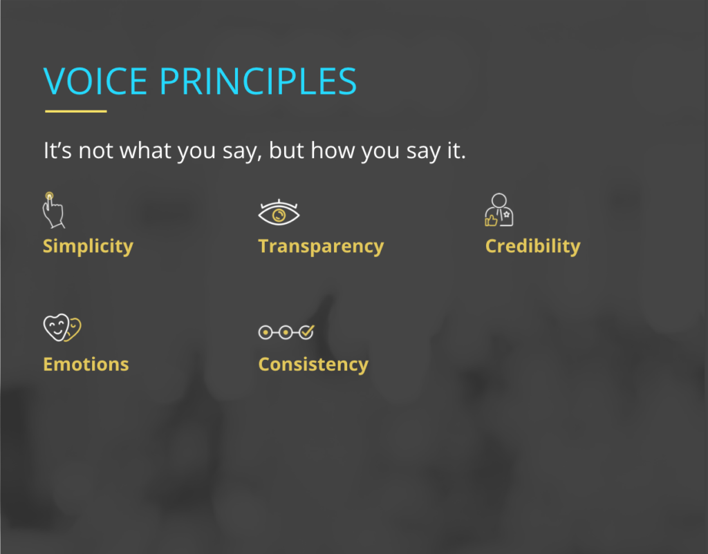
Established voice and tone
I used Western Union’s voice to keep it consistent with the brand.
But, I adjusted the tone based on:
The user’s emotional state at that moment (happy vs. frustrated).
The type of content (status message vs. format error message).
I created a tone map and tone guidelines.
Tone map
Created content principles and guidelines
I crafted content principles and writing guidelines based on my experience and error messages and notifications best practices.
Content principles:
The messages and notifications should be clear, simple, and helpful.
Explain what went wrong and how to fix it or what went well, and what to expect or do next.
Keep the content concise: provide only necessary information, avoid over-communicating the problem.
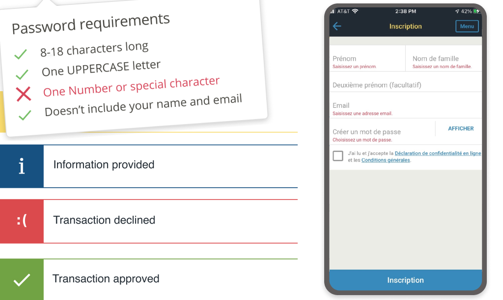
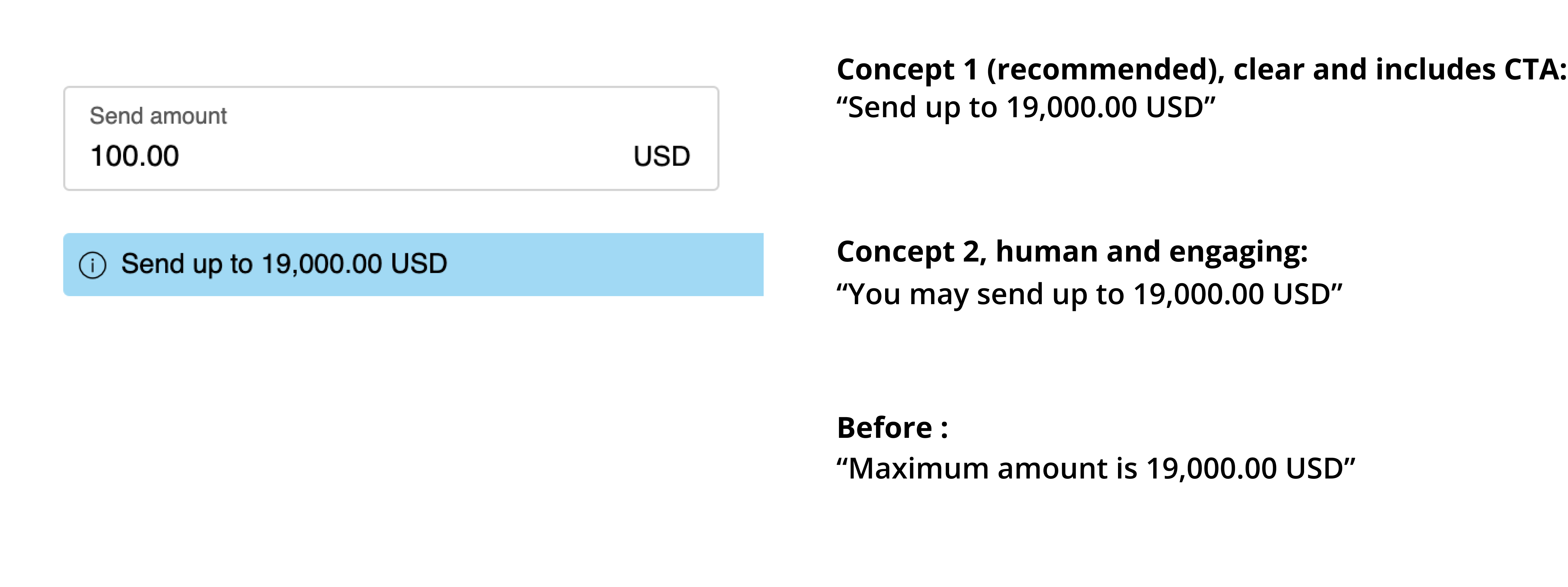
Be specific, for example “Please enter your email address in the format: yourname@example.com” instead of “Please enter a valid email address.”
Don’t blame the user, for example “Your login and password do not match” instead of “You’ve entered an incorrect login or password.”
Writing guidelines
Avoid jargon.
Use contractions to sound more conversational, for example, “you’re” instead of “you are.”
Don’t use passive voice. It sounds robotic and not as clear.
Keep your sentences short, even shorter than usual, one point per sentence, to keep it simple and clear.
Be as concise and instructive as possible while remaining friendly and conversational.
Created prototypes
The UX designer and I created prototypes for each category of error messages and notifications. We designed and wrote content side-by-side throughout the project, from sketching to low and high-fidelity prototypes and final iterations.
We brainstormed how the design and content could work together to convey the message and help the user solve a problem or anticipate a later issue.
I wrote copy for inline errors, dialogs, notifications, instructions, form labels, toasts, tooltips, buttons, and empty states.
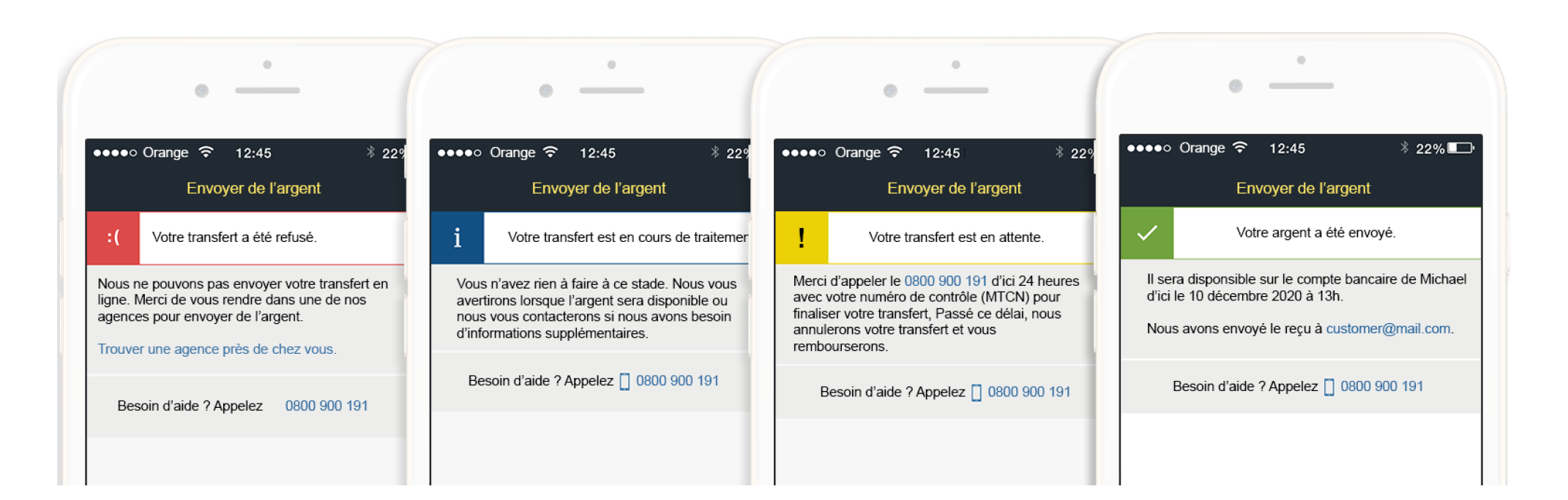
Messaging system prototypes
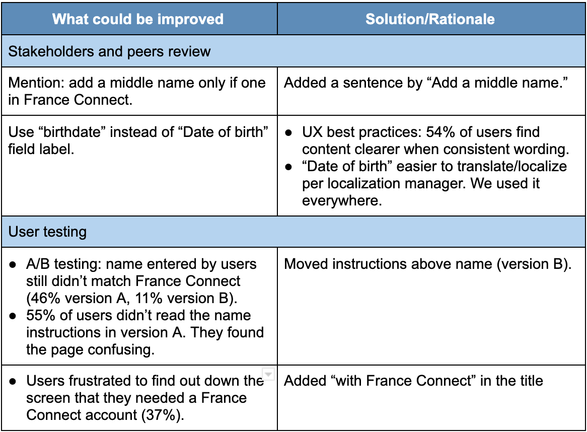
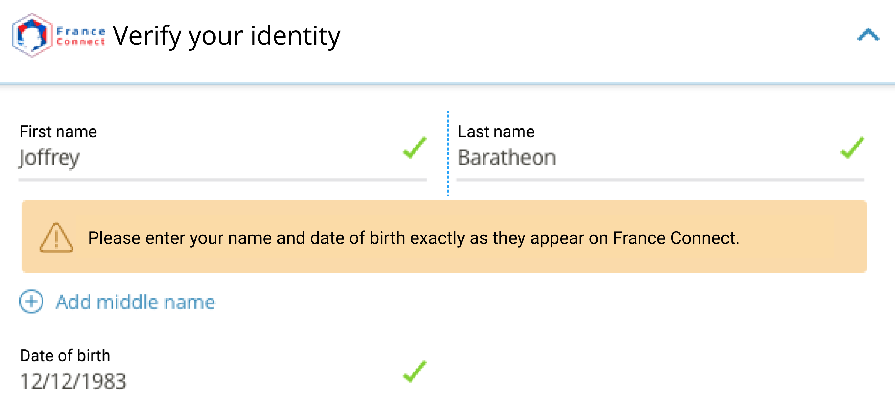
Shared with peers and stakeholders
I shared my content with my peers to get their feedback during our weekly critiques. I also presented my work to stakeholders (legal, privacy, fraud, marketing, and localization teams).
I created a rationale with user research data and competitive analysis findings to explain my content decisions. And I shared my explorations to show my writing process.
I listened to the feedback very attentively, asking how I could improve my content. When facing pushback, I asked questions to clarify the root of their concern and what they would have liked to see. A different tone? A specific wording? A different messaging?
We discussed their feedback. I validated their assumptions with user research or testing. I did more explorations and iterated my content or pushed back with user data when I felt it was in the user and business’s best interest.
58% of users don't know how to fix the error.
63% of users find our error messages too technical.
Before
After
The Solution
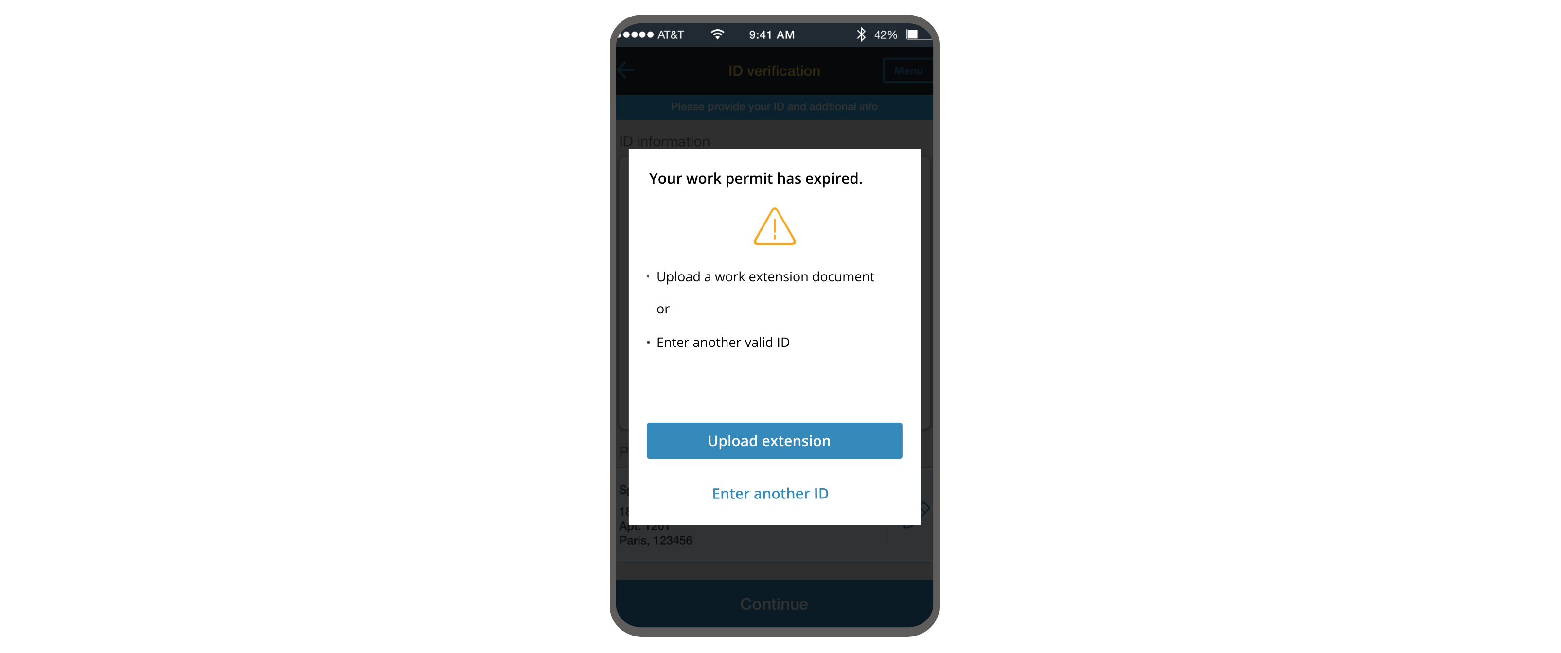
Provided clear instructions proactively
I used notifications and messages to guide and assist customers step by step throughout the user journey. I provided clear instructions upfront to help users fill out forms and avoid issues later.
Explain how to fill out online forms step by step.
Customers don’t know how to provide personal information.
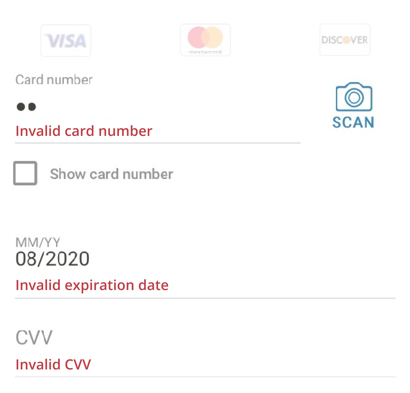
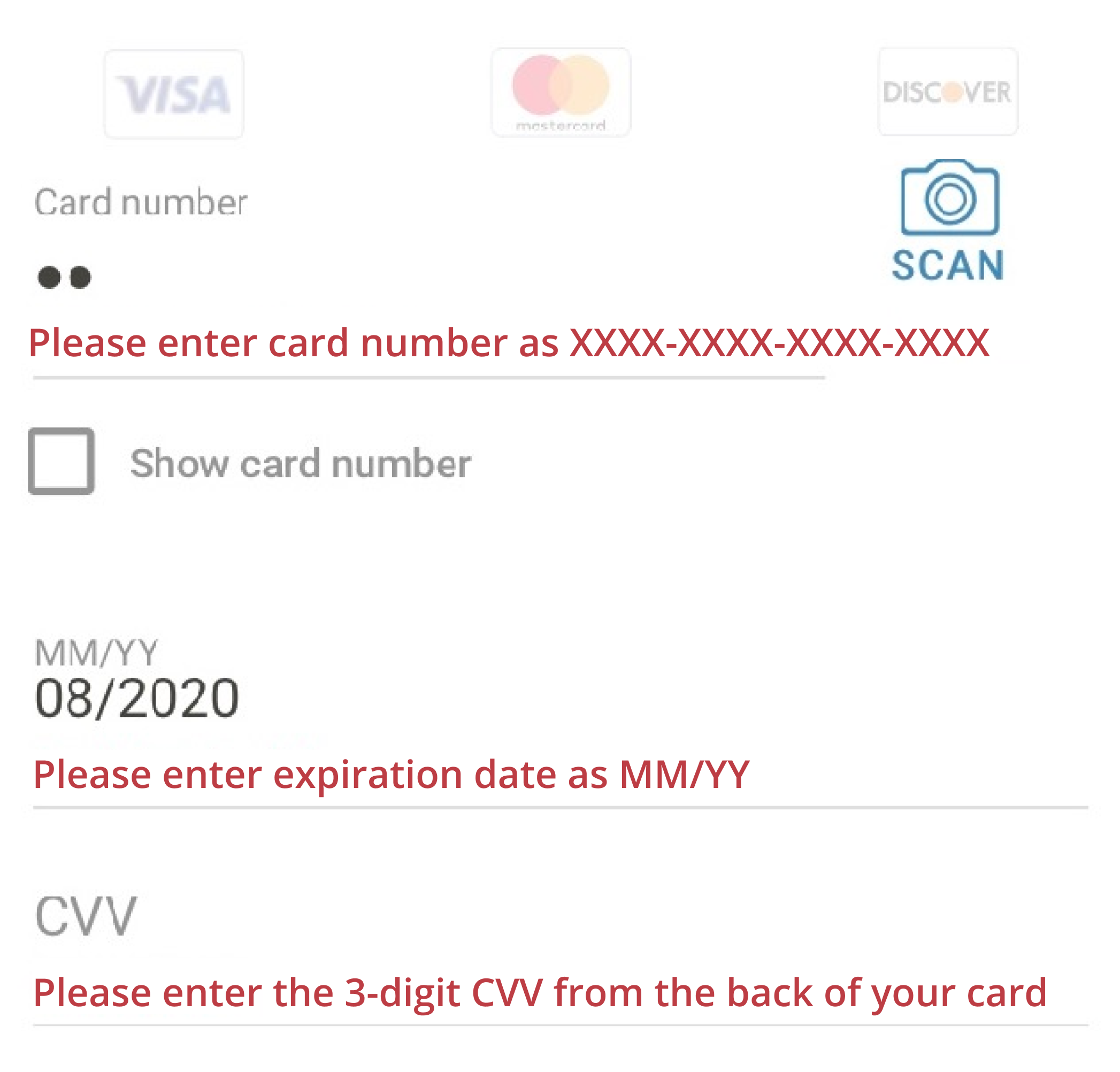
Explained clearly what was wrong and how to correct it
I rewrote error messages to remove jargon and used everyday vocabulary for clarity and localization. I also explained what was wrong with the information they entered and what to do next to correct it.
Before
After
Showed empathy and support
I carefully chose my words to show my understanding and support and avoid blaming the user.
For every message I wrote, I asked myself: “What can I say to make the user feel better and help them complete their transaction?”.
Wrote concise and clear copy
I kept my copy short for clarity. I made sure not to overcommunicate to avoid confusing the user. I kept only the valuable information to the customer and used a direct but friendly tone.