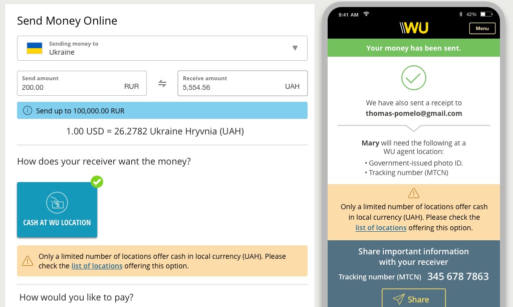
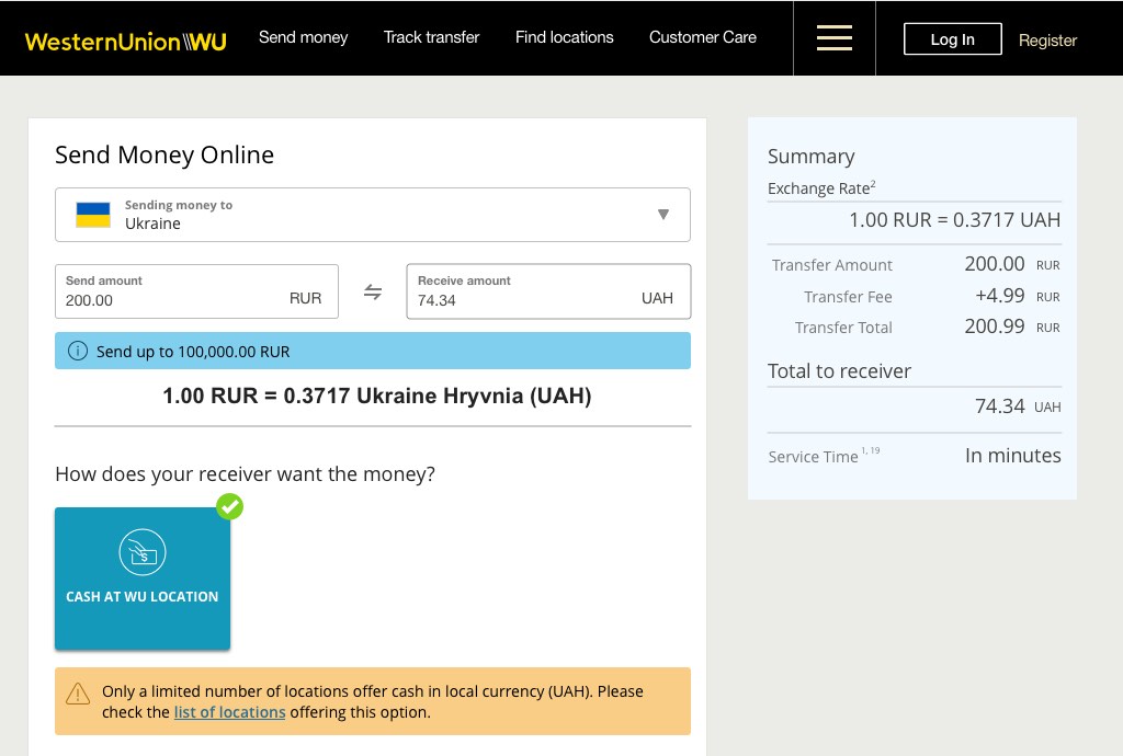
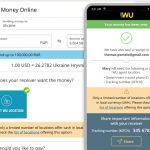
We needed to inform our customers upfront about the limited number of locations offering cash in UAH to clarify expectations and avoid frustration.
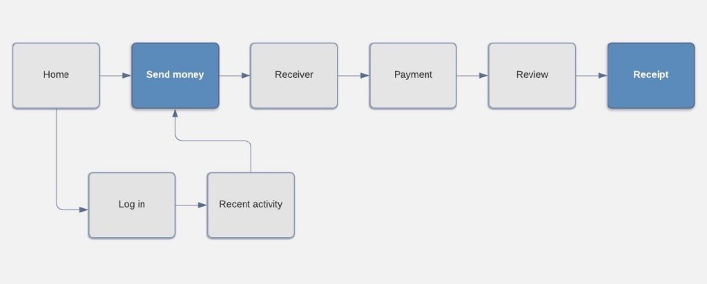
The UX designer, product owner, and I brainstormed to find the best location for a message in the flow and on the page.
Based on page traffic, user research, and testing findings, we decided to place it on two different pages of the Send Money flow:
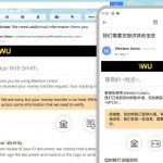
- The first page before the customer gets too far in the flow
- The last page of the flow as a reminder to inform the receiver
We also conducted A/B testing for placement on the page, which led us to put it next to the cash payout option and to make it stand out with color-coding,
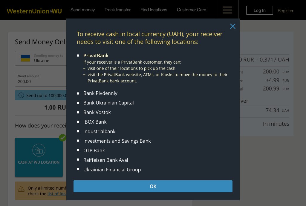
For better customer experience, we decided to communicate an up-to-date list of agent locations where customers could get cash in UAH.
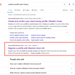
We conducted user research and testing on how to order the list of banks: alphabetically or by the number of transactions. Based on our findings, we decided to use the alphabetical order.
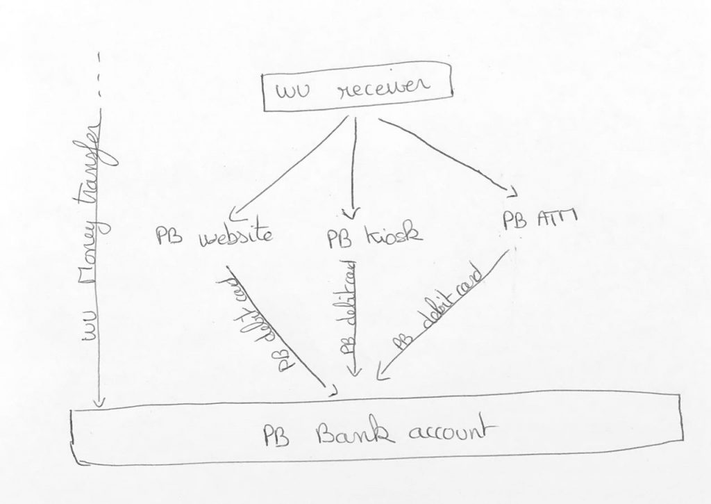
I gathered information about the service offered by PrivatBank to understand it better and make sure I could explain it back clearly to the customer.
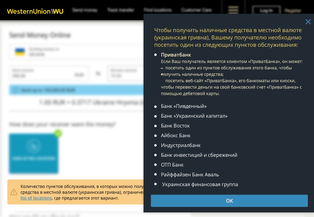
When writing my copy, I favored a friendly tone and voice to match the Western Union editorial guidelines.
I preferred very clear and precise terminology versus generic wording (PrivatBank account, website, or kiosks). I described what our customers should do and how to do it as clearly as possible.
Finally, I kept my copy short and made it work for both our website and app for consistency and ease of content management.